ENGAGE:
The Kitchen Designer

Thanks for stopping by! I'm Susan Serra, certified kitchen designer, and my mission is to take kitchen design style, function and analysis to a higher level. Here's why the kitchen has the most honored place in the home - all five senses reside in the kitchen.  Best...Susan  Contact: susan@susanserraassociates.com
   

Follow my personal profile here on Google+ for LOTS of fresh content! Google+


JOIN ME IN MY NEW GOOGLE+ COMMUNITY:


Subscribe by Email


houzz interior design ideas

Follow on Bloglovin

Interior Design Blogs
Kitchen Design

SCANDINAVIAN MADE

Our webshop of handmade Scandinavian rugs and ceramics

BORNHOLM KITCHEN

Scandinavian inspired, warmly modern kitchens

DESIGN & CONSULTING

Custom kitchen design by Susan Serra, CKD, CAPS

SEARCH BY CATEGORY
SEARCH SITE:

Entries in dining (8)

Sunday
Jun232013

Holiday House Hamptons

Last week I dressed up in all white (as was requested) and went to a fabulous press event in Bridgehampton for the opening of Holiday House Hamptons. Celeb designers were there, everyone in white, and it was a perfect summer day. Following are images of the kitchen and breakfast room, designed by Jennifer Duneier.

As a kitchen designer, I like to point out pros and cons and anyone is welcome to discuss, agree, disagree, etc. so please do! Here's my take on this kitchen.

It's eye catching! There's a sort of "no fear" approach in terms of bold color. At the same time, there is restraint by only using two main color-colors, each of which allows the other to be a visual player. 

The softer color of the backsplash, bold in its pattern, yet softer in tone, supports the brighter colors in the kitchen to make them be the stars. The backsplash is a supporting role, yet it's not. It works because the wall is otherwise uncluttered, given the bold pattern, let me put it that way-it's a good thing! I'll also say that I was initially struck by color, not pattern when I first saw the kitchen, but that's just me and is not a positive or a negative.

I'm not sure I would have added the vertical metal stripes on the hood, but there is interest in lines and circles used near one another, allowing for another focal point on that wall, and it is simple in its execution. And, classic.

The marble works well and adds to the cool/warm design. It was smart not to add the strong tile on to the other walls.

Now to the cabinetry

I have a few issues here. The door design is absolutely fantastic - stunningly different, interesting, original. Love it. 

Personally, I would not have wrapped the cabinetry around on to the range wall. I'm more conservative with cabinetry and don't like to fill all spaces in with cabinetry. There are other alternatives. 

I would also have done something more interesting to the right of the refrigerator. My guess is that the designer wanted to keep things simple and have the cabinetry be sort of cohesive "blocks" in a sense. I think there would have been other opportunities, lots of them, to add interest, but not clutter, on this wall. 

One thing that could have been done is to use fewer cabinets but have them float on the wall, allowing for about 15-18" or so of wall space on either side of the cabinets. That would still be simple and they would appear more "dressed", less utilitarian. 

One could also put up simple but industrial stainless steel shelving which could tie in the appliances and strong hardware, as long as there were few, but properly proportioned items on the shelves. Or span a stainless shelf in between 2 cabinets. There are lots of other things that could have been done on this wall. 

I'm not sure the island had to be that long - it is definitely an obstacle to the refrigerator. Making it a little shorter at the range end would help immensely in traffic, especially as people are walking back and forth in real life. It's always a challenge when there are windows and doors and room connections going on, to find places for appliances, so I understand why the refrigerator is placed there. 

That said, which way should the refrigerator be hinged? Given the location of the sink and range, possibly the other way.

I may have added a cabinet that sits ON the counter to the far right of the sink which would also be more of a furniture look than what appears to me to be too large (wide) of a cabinet in that location. Given the elegance of the kitchen and breakfast room, to my point of view, that cabinet just appears to have too much of a "box" look. It's subjective, for sure.

Very cool lighting and love the turquoise ceiling! It was a fantastic event. What do you think of this kitchen? Would you change anything?

Monday
Mar252013

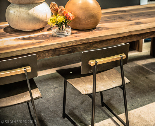
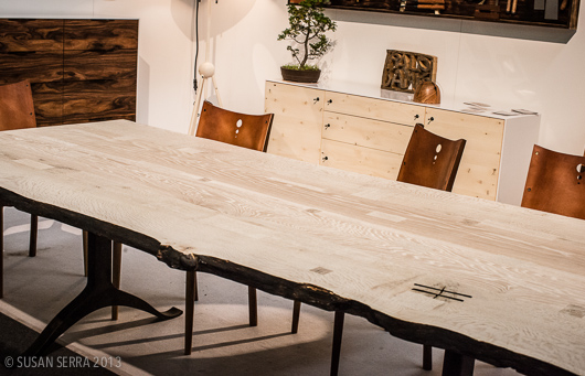
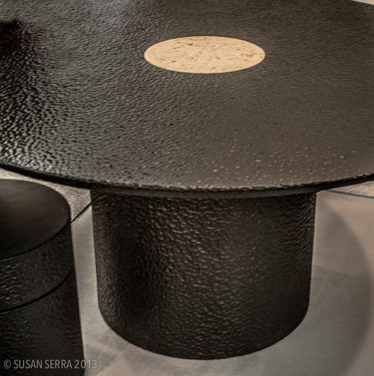
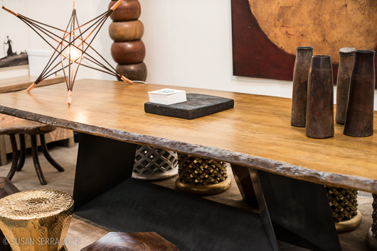
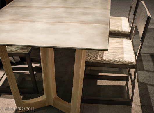
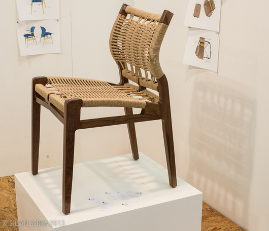
Dining Tables & Chairs At AD Show 2013

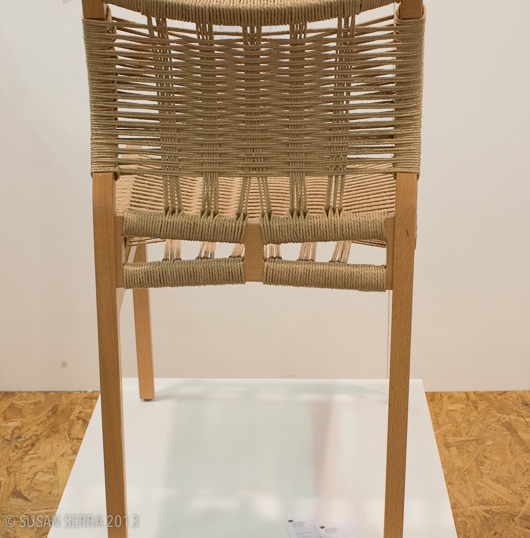
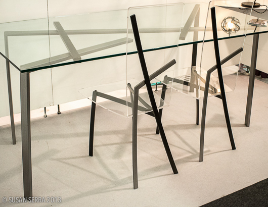
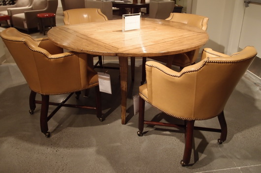
An important part of any kitchen design, both aesthetically and functionally, are the dining table and chairs. They assist in sending a message about the kitchen's style, formality, comfort level and more.

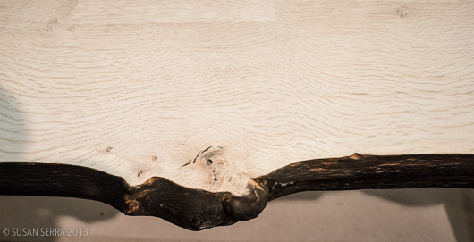
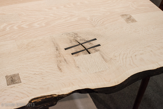
As current trends continue to move toward an appreciation of natural materials and interesting textures, here is a collection of cool, new dining tables and chairs I spotted at the Architectural Digest Home Design Show

Important considerations when purchasing a dining table and chairs for the kitchen are:

  • size and shape based on lifestyle needs (does it need to expand?)
  • maintenance of table top
  • color, texture, materials coordination
  • comfort
  • formality/informality
  • adequate space for movement around the table and chairs
  • style relationship to kitchen and surrounding rooms

All images below are by me, and the brand names are below the images.  Enjoy!

By Karkula

By Palo Samko

By John Eric Byers

By Tucker Robbins

By: Wud Furniture Design

By Antonio Manaigo

By Work & Design

What a design statement a table and chairs can make!

Sunday
Mar102013

Mecox Gardens - Finding Design Inspiration

Saturday, I took a day trip out to the Hamptons. It had been gloomy most of the week, cold and miserable and the morning was a) a Saturday-yay! b) sunny c) much warmer - all good reasons to go exploring on the east end of Long Island.

Designers find inspiration everywhere and my day trip began with a visit to the stunning, new, Parrish Art Museum, a fantastic place to expand your vision. I cannot overstate what a beautiful museum this is. The backdrop of this elegant, organic building (in design and materials) was perfect for appreciating the art within.

This was followed by a stroll through the truly fabulous shops in Bridgehampton, a visit to Tom Colicchio's new, gorgeous, restaurant and hotel, Topping Rose House built in 1842, by the way and newly restored, and more sensory stimulation as I picked up a few things at a favorite market, Citarella. Even my purple potatoes in my salad nicoise were a visual pleasure! I do enjoy being in the Hamptons in the off-off season-it's easier to slow down and take it all in.

I allowed time before heading home, to stop at Mecox Gardens in Southampton. I've visited Mecox Gardens shops in New York City, Southampton and East Hampton many times. I love the design vignettes they put together in their shops and I also love the jumbled look of objects just waiting to be discovered.

Below: The main entrance

I hope these images convey the beauty and style of the objects. So many of these objects can make their way into the kitchen, now the most important living area of the home.

The modern kitchen has indeed been redefined. Since many of these objects have a sculptural quality to them, you can create a focal point that may be experienced as a foundation in a modern style but might also have a traditional, cottage, handcrafted, natural or other characteristic as a sort of companion to the modern object, often adding warmth. The modern kitchen may well have a mix of a few styles to create a unique look. Your personal take on modern interpretation will also benefit from guidance by a design professional to communicate the style message effectively. Take a look and be inspired!

The day was a mix of new and old, modern and tradition via art, architecture, home furnishings, even food. Taking some time out just to explore and soak in disparate types of beauty, just because, is a prescription for, you guessed it, design inspiration!

Friday
Feb012013

Aamanns-Copenhagen - Scandinavian Dining + Design in NYC

Last Friday I was FINALLY able to go to Aamanns-Copenhagen - the authentic Danish restaurant (which also has takeout availability) in New York's Tribeca. Aamaans has been mostly finished for over a year except for a few mechanical issues in the building which took forever to resolve - and I have been waiting impatiently for its opening!

Having a lifelong familiarity with Danish cuisine both from my own childhood in the US, my family in and around Copenhagen and via countless trips to Denmark, I have a deep emotional connection to the wonderful flavors and textures of the food. And, they are wonderful! But, the food is only part of the experience of dining at Aamanns.

The design of the restaurant is beautiful. Here's what you might feel when you enter the restaurant:

comfort  - surrounded by the natural textures and materials

light spirited - via the expanse of white surfaces, furnishings and huge window which brings in lots of north facing natural lighting

engaged  - with the organic feel of the artwork

relaxed - with the casual nature of the bar

inspired - by the collection of beautiful, yet simple, every day objects on shelving and on tables AND by the wonderful, super fresh, food

All of the elements work together to effectively create a comfortable, happy, yet stimulating feeling. The natural materials and textures beautifully merge the Scandinavian style with the vibe of its location - Tribeca. 

The design of the room has a straight forward and functional feeling to it, but it's the beauty captured in the function, i.e. choice of materials, that the Scandinavians do, not only well, but to perfection which so often translates into a straight path toward comfort-both physically experienced and visual.

A few words from Sanne Ytting, founder and owner of Aamanns-Copenhagen: 

"The space is designed by the young talented Danish designer from Copenhagen, Anders Buck Faaborg.
Chairs: Fritz Hansen
Lamps: Mater,
Bodum, Holmegaard, MENU, By Nord, Sort of Coal, Anne Black, are also represented at Aamanns-Copenhagen.
The overall goal was for me to create a piece of Denmark in Manhattan, a feel of being somewhere in Denmark.. clean design, elegant but still warm feel....
The art on the walls are made by the famous Danish artist, Peter Max-Jakobsen - we do rotating exhibits every 4 months in a collaboration with Kim Jørgensen, Oxholm Galleries in Copenhagen."

 Here's how this look can translate into a kitchen design - it's so easy!

  • A foundation of white
  • Natural stained wood floors - #2 oak is just fine rather than a perfect wood with no knots
  • Modern chairs
  • A touch of stainless and/or glass to bring in a functional feeling
  • Organic elements such as pieces of nature, handmade ceramics, textiles and so on
  • Simple, beautiful forms
  • Good natural lighting

Scandinavian style is not only one interpretation, it can be nudged in many different directions. As so many of us are inspired by hotels, restaurants and other public places, I thought the style of this warm space might inspire, which can translate easily into one's home.

I've been inspired and comforted by both the food and the design - very much so! Aamanns-Copenhagen serves breakfast, lunch and dinner AND you can make reservations online as well.

Tuesday
Oct182011

Decoration & Design Building - Fall Market 2011

Last week, I was honored to be an invited design blogger to attend the D and D Building's Fall Market. The D and D building, in New York City, is simply, a fabulous building which houses world class interior design showrooms. Here, you can see the finest fabrics, furniture, lighting, accessories, window treatments, wall coverings, paint, and many more decorative products for the residential interior. It's awesome in its collective design offerings.

The Fall Market had a great array of educational workshops, seminars, talks and panels, with nationally known designers, manufacturers, and print and online editors. Going from a beautiful showroom to a insightful, spirited, talk, for me, was design heaven! Hanging out with the other invited design bloggers to Fall Market was equally inspiring! This discussion, below, was on Transcending Branding Boundaries, hosted by Editor in Chief of Traditional Home, Ann Maine.

left to right: Beth Fuchs Brenner, Peter Sallick, Windsor Smith, Jonathan Adler, Christina Juarez

I'd like to share some of the WONDERFUL products I came across that are located in the D and D Building!

Pierre Frey

EbanistaBelow, interesting organic designs for dining tables

Evanson

Country Swedish

Country Swedish

Country Swedish

Armani Casa

I hope you've enjoyed these selections from the endless products that basically assault your senses once you enter this building! (That's a good thing!) 

Thursday
Aug112011

Modern Dining At Las Vegas World Market 2011

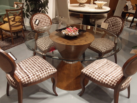
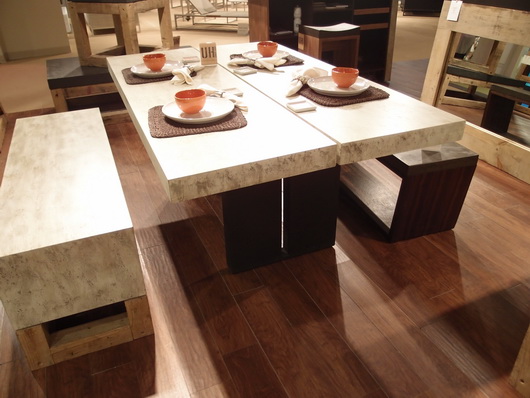
I saw some great pieces, continuing my dining theme from Las Vegas World Market that I need to share with you. Some dining tables and chairs were simple and clean, some super innovative yet elegant, with very exciting decorative details.

Many of these sets are quite affordable. In some cases, it might be advisable to add on a glass top to protect the surface of the table. In some cases a frosted or other patterned glass top could look great and add protection. Oversized glass is also an option, which adds area for dining as well as a nice aesthetic statement.

Take a look!


Bermex Bermex Bermex Diamond Sofa Diamond Sofa Tip Top Furniture Aspen Home Temahome

Sunday
Aug072011

Las Vegas Market - Dining Inspiration

Earlier this week I walked through the Las Vegas World Market Center, the enormous gravitational center for residential furnishings that struts its stuff twice a year. Vegas is a place that makes me smile, so I'm happy upon arrival. 

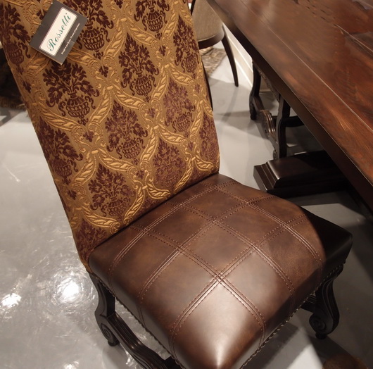
Rossetti

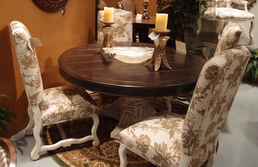
I came with a "kitchen context" unlike most interior designers, architects and buyers; a context in which I think about the transition, stylistically, of the kitchen to surrounding spaces. The dining area is a critical element of kitchen design and what a great place to dream of the ideal dining experience. Following are dining tables seen at the Las Vegas Market.

Rossetti

I always put a strong emphasis on the dining area in the earliest stages of designing a kitchen. Unfortunately, I often see it, if already designed within preliminary floorplans presented to me by my clients, as almost an after thought. I find nearly always, the dining area needs more space devoted to it.

Bramble

Making space available for friends and family to travel easily around the dining area and designing adequate space so that lingering at the table is an enjoyable and not a confining experience, are two important elements of a well planned dining space. 

Urbana Home

Durability of a table's surface and of the chairs as well is the measure of longevity and beauty. Ask questions and observe product construction and durability. Ask if materials and surfaces can be refinished or easily cleaned down the road. Be practical and realistic to determine if your lifestyle can withstand a white painted tabletop.

Rossetti

Venturing away from the kitchen, I'm a strong advocate for multiple dining areas in the home. I especially love a dining table, perhaps a 54" round table, depending on the size of the room, situated in a family room.

Lexington

This secondary or tertiary table within the home will serve as an alternative place to dine - maybe on weekend evenings or weekend mornings or the occasional weekday change of scenery. It's definitely about a change of scenery - why eat at the same table every single evening if another table can be accommodated in another space? A little far to bring in food from the kitchen? That's what trays were made for and I promise the effort is SO worthwhile. I've lived it, thus, my endorsement.

What does your ideal casual dining space look like?

Wednesday
Aug032011

Las Vegas Market Summer 2011 - Kitchen Design Interpretation

I'm here in a fabulous hotel suite in Vegas at the invitation of the Las Vegas Market as part of a small group of bloggers. Our mission is simply to walk/work/discover the Market in our own unique way. No requirements, no expectations. Ideal!

Transitions by Sigla My perspective is different than most interior designers who attend Las Vegas Market. In fact, it greatly benefits the home furnishings industry to invite kitchen designers to see the Market. As the kitchen and surrounding rooms become ever more integrated, I, for one, feel a need to understand the current state of home furnishings and design to tap into what designers are thinking and what manufacturers are creating. Of course, also perhaps to specify furniture as opposed to cabinetry in some kitchen areas, to create the look of seamless integration among surrounding spaces as well.

My eye is unique from all others, my perspective toward public rooms surrounding the kitchen is different, and following is a collection of "dots" that I connected while at Market. It was fun!

Antigua FurnitureHappiness is ... the word "happy" came to mind over and over. Living in a pleasant, easy way seemed to be a continuing theme in the furnishings I discovered. Pleasant/simple lines, fabrics, materials and PATTERNS were mostly very easy to live with, often "pretty" and had this wonderful back to basics/simple creativity that I found lovely.

The Rug Market

Lots of linen - I did not see as much gray as I did at High Point Market in the spring, although there was a good amount across all furnishings and accessories, but there were beautiful muddied beiges and lots of beige linen fabrics, that whole Belgian country vibe. A resurgence of French Country was talked about at Market as well.

Christopher Guy

Mixed Media - Experimentation with different materials in unexpected ways was interesting to see - in rugs, case goods and upholstered pieces. The effect was usually very well done in my opinion.

Saddleman's of Sante Fe

Small Scale - Definitely seen throughout Market were smaller scale furnishings across the board, in every category of furniture. Smaller scale furniture seemed to then shed excess ornamentation, allowing for simplicity and elegance in smaller sizes.

Linon

I'll share more of my impressions and inspiration from the Las Vegas Market soon! And more images. I'm very glad I went - it's great to be immersed in the design world!