How To Design A Kitchen - Kelly's Kitchen Renovation
The design of a kitchen is not just about choosing where to place cabinetry and appliances and then filling in the blanks. Actually, there are many, homeowners and pros alike, who attempt to make the design of a kitchen a simple affair in favor of speed to quickly move forward on the project. But, it shouldn't be that way.
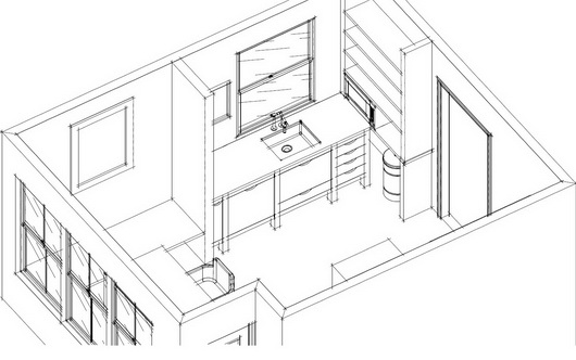
 This was Kelly's existing kitchen. The floorboards are approx 6" wide, so you can tell the space between the table and the cabinetry and entrances is small! It simply has no focus or interest; a case of "fill in the blanks."When I design a kitchen, I don't plan around any one element first, such as cabinetry, appliances, countertop space, other storage, windows, dining area or traffic flow, allowing one single element to drive the rest. Each of these elements mentioned are not only important, but critical to consider nearly equally with one another. What that means is that all elements must be considered at the same time! Really!
So, it becomes an exercise in: "if this, then that" over and over again. That's where the vision comes in - to quickly and frequently look at the "big picture" in different ways and evaluate it objectively. I love the initial chaos of it all! You're actually in limbo for a little while. It starts by my doing a number of floorplans for comparison purposes. Autokitchen renderings brought the kitchen to life throughout the process. Don't miss many universal tips in the solutions entries below - that's where the answers lie!
 This is the final plan chosen among about 5, and the orientation is the same as the image above. The door is removed (another exterior door is a few steps away from the kitchen at left but down another few steps to the outside), the short wall serves as a divider and the dining area is expanded..among other changes! The shallow leg adjacent to the sink wall was designed into the new floorplan-it was not existing.
This approach becomes more intense when I am designing a small kitchen, such as Kelly's. There is no room for error! Following is my thought process on designing Kelly's kitchen, just below. You will see that some solutions are repetitive - that's because some solutions killed two birds with one stone (what a saying!)
- Storage: Kelly would kill me if she ended up with less storage (and she kept asking me if she would) so storage played a big role. However, the boring, unattractive upper wall cabinets and base cabinets were visually intrusive and too "kitcheny" not to mention depressing so those had to go. Somehow storage had to be equally beautiful and ample AND far less intrusive to the eye.
- Solution: I designed a pantry into the plan, I encouraged Kelly to evaluate what she really needed in her existing cabinetry, we utilized a very cool backsplash rail system for utensils, and I designed ample drawer storage for serveware and cookware into the floorplan. Cabinetry was dramatically reconfigured AND beautiful!
- Entertaining: There is no dining room, so the kitchen MUST seriously double as an entertaining area.
- Solution: I found room for a big, bold, dining area with a banquette on two sides, offering flexible seating and the ability to extend the table and put a chair at the open end if necessary, accommodating 8-10 people, seated. Too often, I have seen dining areas be an after thought in kitchen designs. This dining area was a critical piece to the floorplan.
- Selecting Appliances: The existing refrigerator was 30" wide, much too small to suit their needs. The dishwasher was beyond repair, the range was very worn and stuck out like a sore thumb and the hood was a sorry excuse of a hood!
- Solution: Bosch appliances filled every need for this kitchen redesign. We chose a 36" Bosch refrigerator with lots of great features. I recommended Bosch's safe, powerful, and efficient induction cooktop and a Bosch convection oven that would be built below the countertop for a sleek look. The Bosch dishwasher is a workhorse with a convenient top tray for utensils and is one of the only dishwashers that can accommodate a tall toekick that we needed for our cabinetry. I wanted to make a design statement by using a moderately priced and sized Bosch hood, which we outfitted with a tall black chimney pipe for a cool look. Kelly will discuss the performance of these appliances soon!
- Sink/Faucet: Kelly wished for a large sink and we found a wonderful modern style cast iron sink by Kohler, the Indio. The color is sophisticated, it blends beautifully with the countertop and has a cutting board as an accessory which adds to the prep space. The Kohler Karbon faucet is sculptural in its design and functions beautifully. These choices were critical to the look of the kitchen...we wanted the sink to be understated, the faucet to have an artistic quality to it and we needed both to be high performance.
- Countertop Space: Kelly is an avid cook, so counter space was important!
- Solution: I designed the countertop, by Silestone, to have as few every day items on it as possible, freeing up most all of the counter space for prep. We wanted the countertop to blend with the sink, again, as an understated design element, working beautifully with the cabinetry. Part of that design was to use a useful and beautiful rail system by Kessebohmer.
- Small Appliances: Small appliances needed a home - in any kitchen, they creep on to the countertop and before you know it, you end up having very small, shallow pieces of prep space. I vowed this would not happen in the new kitchen - but how?
- Solution: A new shallow "leg" was planned to be an "L" off of the sink wall solely to house small appliances. All cabinet L-shaped turns do not have to be 24" deep! Kelly also wanted a spot for the waste bin that she loved (true!) so I included that in a featured area of that section for a hip, useful, look. I didn't see the need to persuade her to rethink where to put the trash.
- Traffic Flow: Existing traffic flow was simply horrible and needed to be changed. The door and table location in the existing kitchen made a sort of maze which was difficult to move around. The area around the table was cramped and cooking/prep traffic was inefficient.
- Solution: I offered several plans, some with a more open traffic flow than others. Kelly chose the one with the most freedom of movement in the kitchen work area. I quickly thought it would be a good idea to put the table 90 degrees in the other direction, design in a smaller table than the existing oversized table, use a banquette for added space and expected that it would improve the traffic flow times a million! It did.

- Seating needed to be mega maximized since there is no other dining space in the home and they like to entertain friends and family, not to mention the needs of 2 growing kids who are constantly on the move.
- Solution: Nearly right away, I thought the table should be turned 90 degrees from its existing position. Most of my plans included a round table in the corner, also with a long L-shaped banquette, but we later decided on a rectangular table. The banquette offers lots of freedom in seating for kids and adults.
- Non Cooking Activities: Kelly sews and does all kinds of projects with the kids, so there needed to be comfortable and adequate accommodations for project work.
- Solution: A good sized table and a big, flexible banquette allow for good flexibility for seating and working. The kitchen is not only about storage and appliances! It's about lifestyle needs!
- Windows: The lack of windows made the space seem smaller and the small windows that were in the kitchen did not look or perform well.
- Solution: A quick, early thought of mine was to add large windows to visually expand the look and feel of the entire kitchen, allow those dining to enjoy the lovely view beyond and create a dining space with a more open feeling, in part, so one didn't feel so connected to the "work space" of the kitchen. The window at the sink area goes right down to the countertop!
- Aesthetics: Aesthetics had to be on EQUAL footing with a functional floorplan in order to have a comfortable, visually interesting and spacious feeling kitchen.
- Solution: To gain a spacious feeling we used lots of white (including refinishing the floors in a very light finish), large windows, strong horizontal lines, expansive surfaces of tight or small patterned materials and designed a floorplan for freedom of movement. The cabinetry reads as furniture, creating a seamless transition from the living area beyond. Functionally, we positioned open shelves with useful items far away from the dining area to not be obtrusive, found a home for small appliances to enhance the countertop use around the kitchen, added a pantry and used drawers and interior roll out accessories for efficiency. The dining wall, painted dark gray, evokes a more elegant and separate feeling in the dining area. We incorporated shelving for useful items and to create changing decorative displays of artwork and objects.

- Lighting: The light fixtures in the ceiling did not work aesthetically and there was no accent lighting or task lighting in the existing kitchen.
- Solution: We relocated a ceiling fixture, did much reswitching and added lots and lots of task lighting and accent lighting which completely transformed the kitchen into a living environment which can accommodate many focused lifestyle uses and moods. We used Hafele products, which are state of the art in aesthetics and function. More on lighting soon!
The "Wall": The short wall to the left of the existing sink wall turned out to be in the perfect position in the new kitchen plan as a dividing wall for the dining space.
We tried hard to work within the existing footprint. While a variety of about 6 or 7 plans were provided by me to Kelly and Dave, in the end, there was not a compelling reason to move the sink. We moved the refrigerator and cooktop a little bit, but that was easy to do. Their desire was to keep labor costs low and work with what they had.
Could you honestly pick one of these items above and say it should be the driver of the design? Not in my world - they are all important pieces to the design puzzle, all very nearly equally important! It is important as first mentioned, to be able to quickly analyze: if something is changed, what is the pro or con and what does it effect next? The reason this post is so long is because there are so many issues in any kitchen design to tackle, and I bet I'm forgetting a couple more!
Thank you to partners: Kohler, Silestone, Bosch, Hafele, Kessebohmer, autokitchen and Kravet who donated products or services and who had the vision to know this renovation would use their products in interesting and creative ways!




 Tuesday, March 5, 2013 at 08:40PM
