


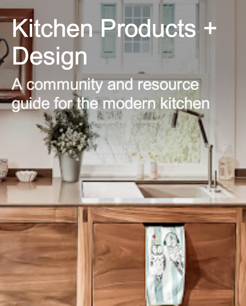


Sleek Scandinavian Kitchens!
OK, it's Friday, I'm feeling good, and I want to show you some modern kitchens from my latest Scandinavian magazine collection! I've now accumulated maybe 4 or 5 subscriptions of my fave Scandinavian magazines (and don't ask me the cost of a subscription, I don't want to remember, and don't tell my husband!)
I absolutely think there are things to learn by looking outside our normal kitchen bubble, to see what else is happening in kitchen design. Let's see what we can learn, dissect, and have fun with today, and also admire. These images are from the very chic magazine Rum Interior Design.
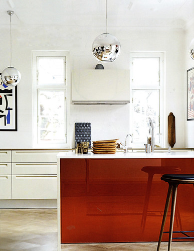
Below: Love the simplicity, the boldness, the white foundation. I also LOVE the artwork, as many of you may know.
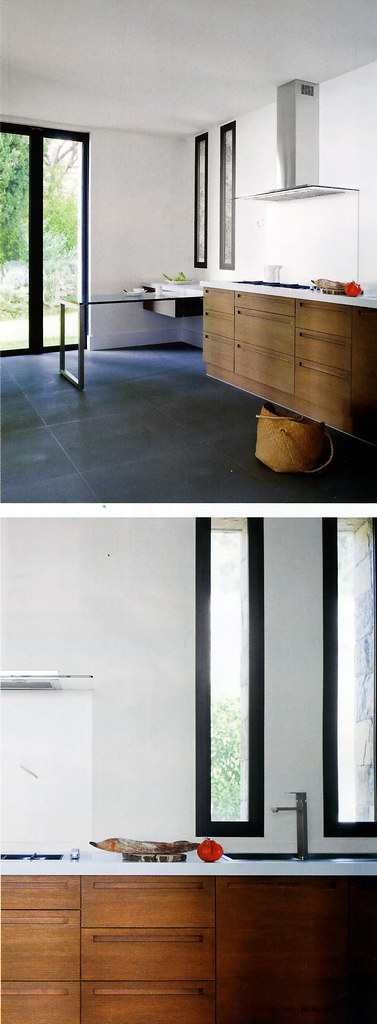
Below: You know, I'm noticing more doors and windows with black trim for some reason, and I like it. Liking the skinny windows here.
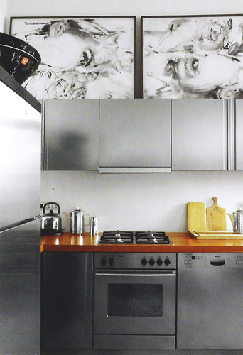
Below: Interesting! Sure breaks up the mundane gray everywhere and creates more importance and weight to the upper section of the kitchen. And it's fun, and fun is always good in my book.
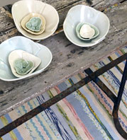
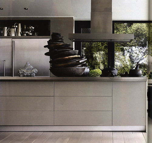
Below: I really like this one because there is a great juxtaposition of the profuse green landscape and the modern interior. Not to mention the artfully displayed accessories. Look at that!
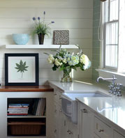
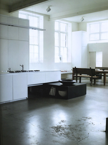
Below: Now, this is not normally my style, but I could move into this space! I love white, I love texture, and I love windows. I'm good.
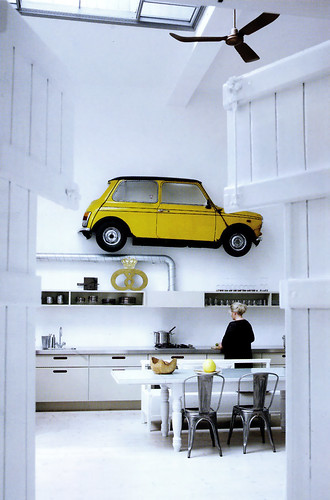
Below: And, who can't smile at this one?? I sure am! We have white, we have major whimsy going on, and a modern point of view...mostly. Love.
And you? What do you like/not like??
 9 Comments

Reader Comments (9)
I loved the gray one with the wood countertop for some reason. Also really loved your pick on the black windows... the tall narrow shape is so striking.
You've just got good taste! :)
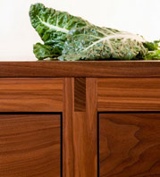
Love the walnut cabinets with inset handles - very Danish modern but married well with the sold stainless faucet and hood. Also love the skinny windows, better than a backsplash.
I like the idea of the last one, and love art in the kitchen but there's something about the proportion that throws me (and the fear that a car might fall on my head).
Being more of a traditionalist, I am missing some fabric - these kitchen all seem a little chilly. But, I am loving the artwork!
Laurie, thanks for your comment! That would countertop really stands out. I do like that. Please stop by again.
modernemama, you're right about the car on the head syndrome, but you know what I really want? I'd kill for one of those bakery storefront emblems...the gold pretzel shape. They identify bakeries in Denmark, and if anyone knows of how to get one, please let me know, it will remind me of the authentic Danish pastry!
Linda,ok, just wait...cozy kitchens are coming next week! :)
I love the style of these kitchens, but then, I am a Scandinavian girl myself. I also made a post about the car on the wall - it is just great!
That last one with the whimsical car is to die for... even the chairs are perfection. :::swoon:::
That black trim is going to become dated pretty quickly I'd bet.
Another vote for the gray with the wood countertop. I'm not ape about the prints above the wall cabinets in that one, and I'd probably go with a mosaic backsplash between the countertop & bottom of the wall cabinets.
I love the simplicity of all of them. Thanks for sharing!
I vote for the long skinny windows in photo #3 and the floors in photo #5. The concrete floors in photo #6 make my feet and legs hurt just looking at them, though the windows in #6 are a plus and in photo #7, last one, I love the expansive space. And yes, the art in each one is a big hit with me.