Cool Scandinavian Kitchens
You all know I'm good for Scandinavian kitchens! I haven't kept up the pace on my (yes, beloved) blog as much as I should have in recent months due to several reasons, but that aside, despite the ongoing miserable economic conditions in our country as well as locally, I'm feeling hopeful and ready for a fresh start. As an optimist, which I consider myself to be, that's my job!!
I think part of feeling ready for a fresh start is the office I'm putting together. I'm thrilled with my new home office, and it's only this past week that it's been set up, really, since Sunday, and we moved December 29! Since moving in, I've only had my computer on a table, and have been very patient as we've spent these past weeks organizing the rest of the house, which we continue to do. We still have about 25 boxes to unpack, probably, out of nearly 200.  But, with new countertops in the office since last Sunday, adding artwork (lots of artwork), a Stanley Steemer carpet cleaning, office supplies (it's all about the height of each inbox!) organized, I'm feeling great, and ready to go!
During this time, I HAVE collected a good number of Scandinavian magazines from visiting Danish relatives and from subscriptions of Scandinavian magazines. And, I just spent $300 on new subscriptions for Scandinavian magazines today (good thing the husband doesn't read this blog!) Want to see some?? I really want to share these kitchens with you, which are not so easily available to see and study otherwise (quiz on Monday.) ;) Sure, more varied content will come, but having just organized my Scandinavian magazines for the first time (ever!) I may be on a roll with fresh images in the coming days and weeks.
I think, unlike typically, I'll throw in some comments. Please feel free to comment too. I'd love to know others' perspectives on these kitchens. Images from Rum, Bolig and Bo Bedre.
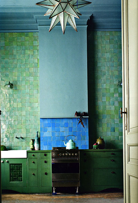
Wow, this one, below, is pretty amazing. I love analogous color schemes. Perhaps the upper section of the hood projects forward to capture the cooktop fumes, I hope so. Would like to visit, but wouldn't want to live there.
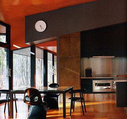
I love this, below. To me, a perfect juxtaposition of cool/warm, texture/smooth. I could happily cook in this kitchen, being among nature and steel...an exciting combination! Bright, textured orange against what looks like flat medium brown? I'm there! The clock? I'd want it larger.
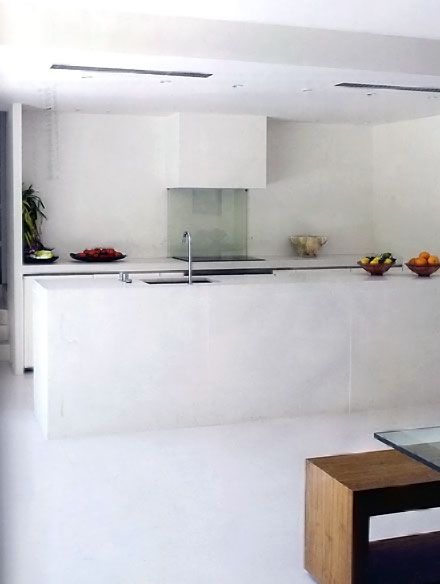
Below, ok, it's bright, but to me, depressing. I'm surprised at my reaction. Tooooo simple/bleh to feel serene (for me.) As an example of minimalist modern kitchen design, it's fantastic. But, I think I may have elongated the hood above on each side to maximize the design concept.
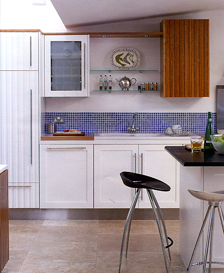
Below, sure it's IKEA-like in its feel, but I love the unexpected introduction of the ribbed white and wood cabinets, the halfway up mosaic tile, which clearly sets apart the cabinetry/shelving above as its own element, and the boldness to position the wood wall cabinet close to the angle of the ceiling, creating an exciting design feature.
Below, no, I'm not on board with this. I see an element of fun. I get the surprise of the ornate brass lamp, but all I really see is a mishmosh!

Below, yeah, I can go down this road, definitely! Another semi-analogous color scheme.

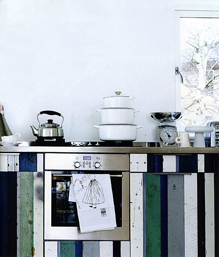
Below, very Scandinavian. Give me a little opportunity for artwork or a sculpture within the space, and I'm good! Definitely has that Hansen feel that is so wonderful.
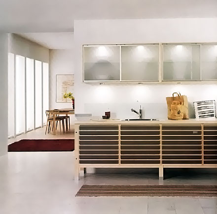
I have more! What do you think? What's your favorite?
 Tuesday, February 3, 2009 at 06:50PM |
  21 Comments |







Reader Comments (21)
The first one is my favorite, definitely. I love the color and texture of the tile, and I like the light fixtures. The only thing I don't love is that the range just seem too small and out of scale for the room, and something aboust the hood seems a bit off to me.
I also like the one with the striped looking wood.
The modern sleek kitchens are very nice to me. I have a friend who is putting a kitchen like that in his Victorian kitchen. I just couldn't see doing that, although I certainly didn't put in a "Victorian" kitchen, either in my Victorian.
I hate the white one that you don't like, although maybe I'd like it better in person.
I love the brown/orange/black kitchen (#2), it has a conformity of colour and design without being too matchy. The fourth kitchen, while I love the wood and the ribbed cabinets, has too many diverse elements: tiny blue tile countertop (I'd have gone up to the height of the stainless backsplash next to it), large beige stone floor, black stools and island countertop, two types of white cabinets and wood - it's shaker/country/contemporary feels to me disjointed and unharmonious.
I love the second for its overall architecture (wall to ceiling windows) and the sleek dark cabinets against the stainless steel appliance.
I like the last for the light surfaces and horizontal lines.
By the way: Bo Bedre ("live better") must be around since 50 years. I remember that my parents bought it whenever we were on vacation in Denmark and I was still a little kid.
I love the Scandinavian kitchens illustrated on your blog. In fact I really enjoy your blog, and I'm glad to see that you're going to ramp up content again.
Your writing style is musical in nature - akin to a well-played folk guitar. It has that same "ringing" sound to it. Keep up the great work, and keep on strumming.
Keith.
Love, love the color combo of the first image - the mosaic wall and the star lantern are gorgeous! I actually like the scale - not sure why - other than it downplays the kitchen aspect and really plays up the color and architecture.
Oh, I LOVE the first one and its $10,000 (at least) worth of tile. I can feel this kitchen in my bones. The stove would have to be bigger. And I love the natural light from the left. I could spend all day in this ocean of delight.
that green and blue kitchen makes me drool. fantastic look
I just love that blue and green kitchen. So beautiful!
I'm with you on the analogous color schemes, only I didn't know that what it was called. Nice post.
The second last is awesome. Normally I don't care much for stainless steel machinery but it does go extremely well with the shabby chic thing.
I'm happy I found your blog btw.
So clean and simple, great colors I love scandinavian design, defiantly one of my favorites.
Great pics, thanks for sharing.
Michelle
Jeannie: Thanks for your input! Sounds interesting...a modern kitchen in a Victorian themed house. It's always tricky to be eclectic, but if done well, it is a strong statement.
modernmama: "without being too matchy" - I think you put the nail on the head for me. Typically, I like to blend, and purposely not match. I like shades a bit off from one another, so I'm with you on that.
Connie, I am not surprised you liked those two kitchens. I think I'm getting to know your aesthetic. :) Interesting re Bo Bedre, I didn't know that.
Keith, thank you so much for the very lovely comment. It is very much appreciated.
Linda, well, you're right, it sure does play up the broad scale of the architecture. You really seemed to have a big reaction to it, that's cool!
Kathy...another big reaction! I'm glad it spoke to you, isn't that the point of what we do? Enjoy!
Sean, maybe it's the sort of organic feel of blues and greens that we are drawn to. Glad you like it!
Dwellings and Decor, Thanks very much for stopping by, and I'm glad you enjoyed the blue/green kitchen!
Kathleen, it's funny, I do seem to be drawn to analogous color schemes. I have no idea why, hmmmm. Glad I could help you identify it!
Daniel, thank you for your comment. That kitchen seems to be as modern as shabby chic look as one can find in a kitchen. It seems to go in a few directions very effectively but with a simple style. Glad you stopped by. Like your blog too. I'm a long time collector of your items.
Michelle, glad you like Scandinavian design, I can't stop showing it, it's my favorite aesthetic! Thanks for coming by. :)
Coolest kitchen contest: http://www.chdmag.com/best-kitchen-contest
I Def. Love the analogous color schemes Kitchen (1st Picture) .....
I really like the unexpected texture in these kitchens. very fun! the white one looks like it is a nightmare to keep clean - but i do like the effect :)
Susan,
What a gift! This really beats the pants off the boring kitchen cabinet brochures. Have you published design books? Your selection of photos is perfect.
Looks great, you chose great contrasting colors for the wood. Any idea what brand of paint this is?
Not sure the brand, but i see your name is Benjamin Moore Paint, try checking out this site if you see anything that would work for a similar project... http://www.aboffs.com/paint.htm
Hello
These kitchens are beautiful, the first especially. Could you tell me where I could get tiles like the green ones featured? That is the mother of pearl type ones with the uneven looking surface?
Thanks so much
Regards
Marian