New Style White Kitchen - Scandinavian, Of Course!
Just when you thought there could be no more true innovations in kitchen cabinetry, I mean, you open a door and you close it. You open a drawer and you close it. What more could there be to that concept?
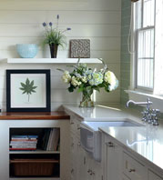
How about this combination of little recessed spaces set amongst the cabinetry? I spotted this on the teriffic blog, Emmas Designblogg. Whether the recessed nooks are used for decorative or useful items, I think this is a fun idea. While you're at it, check out this link from Emmas blog too. Images are from Skona Hem. What do you think of this style?


 Wednesday, October 8, 2008 at 08:42PM

Reader Comments (6)
I love white kitchens (just finished renovating my own)! The cutouts and niches do a nice job of breaking up the wall of white, and the wood grain adds a nice modern texture. I liked the recessed handles too - very innovative!
This is so charming!
I love the few lighted ones, and the base cabinet cutouts seem to be finger pulls.
It's like peekaboo.
You are absolutely right.
There is always something new under the sun.
That's great! This kitchen has really interesting use of contrast -- The rounded edges are a nice contrast to the rectangular cabinets, the positioning of the nooks are asymmetrical in an otherwise symmetrical layout, the white panels with the wood interior -- really cool.
I also really like the idea of nooks as an alternative to a glass door for displaying items!
Absolutely beautiful! Susan, you've inspired me to get going on redecorating kitchen! Can you please tell me the paint you use. Thanks!
I love this kitchen, somehow retro but still modern. Simple and peaceful!
I'd like to echo the comments about the cabinets being being beautiful and still retaining an elegant retro look. I recently re-did my kitchen and a big part of my kitchen design was using ready to assemble kitchen cabinets. It put me in the right state of mind and left me with a new level of confidence I didn't have previously.
Again, this is such a lovely kitchen. Best of luck.