


A White Kitchen by Susan Serra, CKD - Published by Better Homes and Gardens
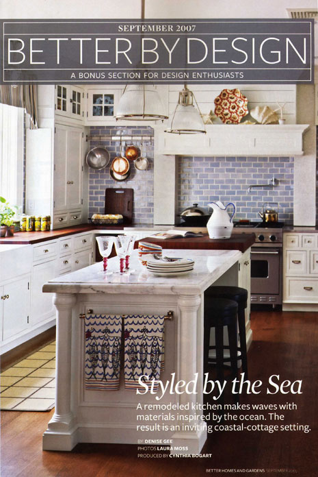
 I arrived home last night from my vacation to see one of my favorite recent kitchens I've designed, finally, in print! The feature just came out in the September issue of Better Homes and Gardens. It's in a section called "Better By Design."
I designed this kitchen a variety of different ways for the client, in an extensive design process, and in the end, the client decided not to change the existing location of windows, doorways, and appliances. BUT, that was only the start of the story. Maintaining these same locations, I wanted there to be a renewed excitement and importance to the kitchen design, but, based on good design principles, rather than easy, but, uninspired "runs" of cabinetry as you can see in the "before" pictures. I also wanted to "lighten up" the area above the refrigerator, which was achieved. A much more spacious feel on that side of the kitchen than before.
Other Ideas Which Didn't Make It:
Some of my ideas were not implemented that I would have liked, but I have to remind myself, it's not my kitchen! I had recommended that the rear wall, rather than subway tile, be some sort of subtle stone, a slab material, although the end result looks great. I also did not want to connect the cabinetry on each side of the range to each wall. I thought it would look interesting to be open, a bit unfitted. Then, I suggested open shelves with the wall showing behind, and no toekick. In the end, the client wanted a more "connected" look, but we did maintain the open shelving below, which makes it.
New Ideas
New design ideas were developed and explored, based on the proportion and scale of the space as well as taking into consideration the architecture and style of the home. I also created a personal style interpretation for the client, which bridges the concepts of tradition, a nautical feel, a bit of a "commercial" look, and some real beauty included in the mix too. Please see all of the images in the gallery.
 22 Comments

Reader Comments (22)
Beautiful. I really like the use of the 3/2/1 drawer combination. Three top, two middle, etc, Very creative.
Woohoo! Good for you! How long have you been waiting for this to come out? I am running right out to buy a copy (I forget if I have a subscription).Looks great and check back in a while, I'll do a post on my blog as well!
Thanks Laurie,, and good to see you blogging again!
Linda, thanks! I guess it was shot last year sometime, it always takes awhile. I'm not sure if you'll find it because it's only in a particular segment of issues, about 9 million, I believe! Thanks for your good wishes.
That is my favorite kitchen in your portfolio. There is something very calming about the colors and textures you selected. It's the kitchen I used when linking back to your blog during our recent "battle".
Congrats...
Susan, you're right! It's not in my issue. Bummer. Oh well, your pics online are great to drool over!
Brava! How beautiful! And congrats on the spread!
BTW, I posted some wonderful refrigerators here. They're lots of fun, check 'em out!
Oh, I'm glad you all respond well to this kitchen! Mark, never a battle, just a friendly debate and thank you for the link! Thombeau, leave it to you to bring us something fun and (literally) cool!
Hi Susan
What a great kitchen this is that you have designed.
Very well thought out on every detail and very beautiful. Well done!!
Hello Susan!
What a fab kitchen! I was at the grocery store this evening and almost bought this magazine. I could kick myself for passing it up! I will buy it on my next trip. Congratulations! It is beautiful. I especially like the tile on either side of the range with the pot racks. Very handy and adds alot of personaliy you don't usualy see in your run of the mill kitchen. Love it!
Congratulations Susan- beautiful, beachy kitchen! We will be sure to share the gallery with our readers in our Renovating Blog. Best, Connie and Anne
Beautiful kitchen. What color of white did you paint the cabinets?
Thanks for the kind words! Very much appreciated, makes it worthwhile in the end to hear the good stuff.
The color, it's called Cottage White, but it will appear differently on your computer monitor than it does in real life, don't forget. :-)
Thank you for your willingness to share the paint color. What brand did you go with? Pratt & Lambert Cottage White is a taupe.
This was a color from the cabinet company, it's their own color called Cottage White. Hope that helps..
First, beautiful kitchen, of course. Secondly, I love this post. I've never read a "behind the scenes" recap of a beautiful magazine spread kitchen from the designer herself. Very interesting that you still had things you wanted to change because to the rest of us, it looks great!
Eeek, this is hugely exciting. Wowza, Susan!!!!!
This is a beautiful design Susan.
Congratulations!
You are everywhere with it.
I was so impressed by the bold use of a towel rack on the end of the island. I am always doing "built-in" ones on the ends of islands but the simple towel rack applied is a master stroke.
This is a beautiful design Susan.
Congratulations!
You are everywhere with it.
I was so impressed by the bold use of a towel rack on the end of the island. I am always doing "built-in" ones on the ends of islands but the simple towel rack applied is a master stroke.
I just found this site the other day and have been coming back to the images of this kitchen. The blue tile is such a stunning component. What is the color and make of these tiles? Keep up the great blog!
I just realized that you designed this fantastic kitchen. I found the image a while back when I was looking for some inspiration and fell in love with it. I love the legs on the island. They are so classic!
those blue tiles make me seriously weak in the knees!
Is this Dupont's Zodiac quartz on the island? I can't quite make out the text, but the product looks gorgeous in the photos.