


Wednesday
Jul182007
Modern Kitchens - Metropolitan Home
Here are some modern kitchens from Metropolitan Home, which came in the mail yesterday. It's a great issue...go out and pick up your copy. Meanwhile, I would love to know your thoughts on these kitchens.


 10 Comments

Reader Comments (10)
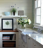
I LOVE the 3rd kitchen, so open, and those windows! *Sigh* The 1st kitchen is lovely, but my eye goes imediately to the lighting, that would annoy me in my own home. The 2nd one is too blah for me.
I like the cabinets with shelves built in on top from the first photo.
All beautiful. The 1st kitchen: Almost ideal layout to me. I actually really like the dining area lighting. My strong preference would be for some sort of visual separation from the living/dining room to the kitchen--like a huge salvaged transom window, beam, dropped ceiling, posts--anything to make it seem less gymnasium-ish especially when it's just you and the dog, no guests. 2nd: I can't tell where the kithcen is. 3rd: Where is island lighting?
Thank you for your comments. I would like to continue to get impressions.
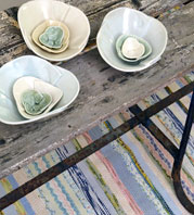
I also like the lighting in the first kitchen. It adds an element of something unexpected, since the general design is very straight forward. There is much restraint used in this first kitchen, which is very appealing to me. I think the top most open cabinets are too short, I don't like that proportion. I'd like to see more of the working part of this kitchen. I love the texture on the chairs and I also love the colors in the rug. I think it's a very nice space.
I wish I could see more of the second kitchen, it also looks quite interesting. The owners have also used restraint.
The third kitchen has an interesting use of materials, definitely. That said, I know I couldn't feel at home here, it doesn't speak to me as comfortable in any way. Cool, functional, yes, but it ends there for me.
Tomorrow's images will be interesting to compare against these. It will be a good contrast.
I like how "un-kitcheny" the first photo seems. The whole space is defined, yet integrated. I like the lighting too. Would love to see a nightime shot of the space.
The lighting in the first image is awesome. So unique and the open concept makes the entire space seem so large but unified. Great use of rustic wood ... I just love the first kitchen.
Jenn~
I think the second and third pictures are of the same kitchen, but the second is shot looking through the dining area. (Compare the large window frames, and the placement of the fridge to the left, the dishwasher below and the stove hood to the right.)
I LOVE the huge windows with all that natural light flowing in, and the geometric simplicity of it all. I find this one very masculine and would be very comfortable in this.
I'd love to see other shots of the first kitchen; this angle makes it seem too cramped for me.
Would love to see a couple of big vintage industrial-looking fixtures in the third kitchen rather than the minimalist wire track lights, but that's just my taste.
I am actually just loving that last pic! I think it might be those colors.
It would be nice to see more of each room. I find the lighting in Kitchen 1 very distracting. There seem to be a lot of wires but not much light output. Kitchen 1 is too dark for me.