What Is Kitchen Inspiration?
I have had this glossy GE Monogram brochure opened and folded back to a particular page for months. I have no idea when I got it in the mail. It has traveled from one pile to another pile to another, I'm sure I'm not the only one who does this. It's a reasonable attempt at organization...isn't it??
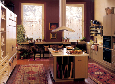
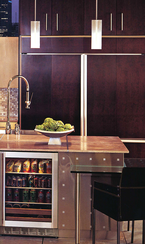
This first image of the red/cream kitchen just struck me immediately as strong and stunning. I know I would design the cabinetry in a different way, much different. Parts of the cabinetry "speaks" to me, much does not. But, as I often try to communicate to my clients, it's the "feel" of the room, not any one element, that makes a kitchen special. That's the secret ingredient to a wonderful kitchen. It may not be the countertops, or the cabinetry, or the appliances, but all of it and much more working together, each with an important place in the design to collectively evoke a feeling that the owner wants to feel. Each piece is another layer in the entirety of the design. Each piece plays a key role.
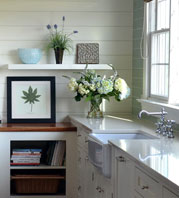
As a kitchen can be an expensive proposition, enormous focus, and justifiably so, is placed on those three elements...cabinetry, appliances, and countertops first and foremost. And that is as it should be. BUT, as we see in this first image, the other layers of paint, yes, simply paint, accessories, and the use of texture, is, well, everything. I don't know about you, but this first kitchen speaks to me. The others are wonderful for other reasons. The message is, every part of the design has valuable work to do. First, however, one must dig deep to explore and discover what one wants and needs to be surrounded by to feel great joy, and comfort, or, for that matter, stimulation! More about that process soon.
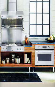
Thanks GE Monogram for permitting the use of these images. As stated above, careful selection of appliances in terms of function AND design is also a critical layer. Very critical. These appliances work to enhance the design of the kitchen. That's the goal. Enjoy!
 |  |






 Friday, June 15, 2007 at 06:11AM

Reader Comments (8)
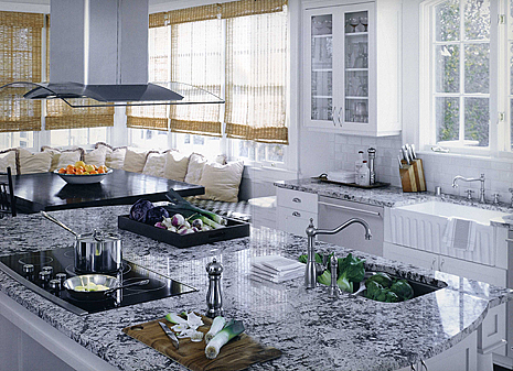
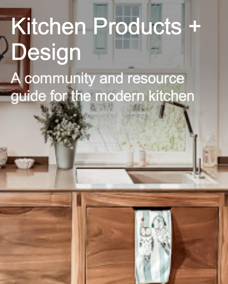
Good points! I love the top photo as well. So warm and comfortable feeling. You can smell the baked goods. The white kitchen seems a little clinical, although the window shades help warm up the look a bit.
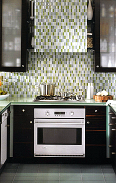
Ooh, I have that same GE Monogram brochure dog eared to page 10. I got it mailed to me last year and can't throw it out. I wish you had a picture, you don't show it here but what I love about the kitchen on page 11 (if the pages were numbered), is the floor. Yes, the floor gets my attention. I love large floor tiles. At first glance the floor tiles look enormous, but get a second look and you see the 3'x 3'tiles are really made up with nine 12" x 12" tiles. The tile setter may not have been to happy at laying out two colors of grout. (Clients should know that will cost more), but look how great it looks!
I envision would this same kitchen would look like had they not done that trick installation on the tile, and it would have just looked like, well, ordinary.
Susan, I just counted the pages, it's on page 11, why don't they number these things.
Ok, now for the rant. What is up with appliance brochures where they have to devote a full page to a women in stiletto heels? The only part of the kitchen you see is where her heel is tapping (almost hooked into) the handle of the warming drawer. Don't try this at home! And the opposite page is a picture of one half the pair of her stiletto high heel with "GE Monogram" on the metal strappy thing. Gee, are the stilettos included in the purchase of appliances? Honestly, this type of advertising is annoying.
good layout, good flow, great products, colors. materials and textures that make your heart sing. The first one has a touch. And oh the ceiling height!!!
The others are fabulous, but look "done".
Let's not forget: Good light, a good feeling. the untangeables of comfort. It's hard to communicate that to clients.
Off topic: It's why A-Rod or Derrick Jeter are such good baseball players. Can put your fingers on the stats, but there's more to it. (PS I am a Yankee hater, as any self-proclaimed member of the RedSox nation should be, but what can I do... ignore the stats? And it's an easy analogy)
Good points, all of them, thanks for the feedback. I've got to get a picture up of that tile/grout, maybe for a future post, thanks for the tip on that. I'm not sure I caught it.
Laurie, I think there's a lot more tolerance these days in the marketplace, and a lot more acceptance IMO (by women) in the marketplace for the joys of being a "girl". There's definitely been a sea-change. I see it in my grown daughter and her friends. I think the ad links status objects, bling, certainly shoes(!) with the status of Monogram appliances. Sort of monogrammed (name) fashion = the status of Monogram appliances, that's my take. I think it's a fun thing. It doesn't offend me. In another time, it probably would have!
Abbey, I can't even go there...a New Yorker talking about the Yanks vs Mets vs Red Sox? No way, you're not getting me into that territory!!
I was just thinking about this yesterday. I mentioned to you once that I wish my kitchen had more character. Yesterday, however, I was cooking in it and thinking about how easy it is to cook in.
Do you know what the countertop material is in the second picture? So pretty.. makes me wish I hadn't just ordered absolute black.
Kristen, yes, I remember. We do go back and forth, don't we? I'm always evaluating and reevaluating my surroundings!
The countertop material, no, I don't know what it is. I will try to find out. It's really different, isn't it? It's great.