


I Want This Cabinet Finish For My Kitchen - I Saw It In The Magazine!
I received a call from a client, which is not the first call of this type. The client loved a kitchen that she saw in a magazine, it just spoke to her. That's a great thing, that's really what I hope will happen for my clients, that in some way, they will just know when something is right.
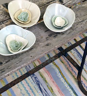
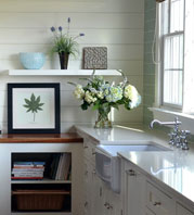
You cannot predict when it will happen, or where. It could be a sample found in my showroom. It could be one of the kitchens I've done that speaks to a client, or it can be one from a magazine that is "the one." Sometimes, it is different elements of the kitchen that speak to clients. In this case, she loved a kitchen seen in a magazine, but she really responded to some of the colors of the materials.
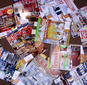 Magazines are great for inspiration. They are an important tool in the process. They can bring to life what you may not have been able to express, or even knew you wanted.
The thing to be careful of, however, is to really understand that the colors in a magazine, on the printed page you are viewing, can be very different from the actual material samples! First, the lighting in the environment where the photo was taken may have been augmented by photographer's equipment. When the image is taken, the camera itself changes the color, followed again, by the tweaking in image software programs to make the color what the art director wants or what the photographer wants. Then, comes the printing, and by the time the image gets on magazine grade paper, depending on what color the paper is, it's a very different color from the original material. And, we know that color is definitely seen and appreciated in nuances. Maybe you now see, this color nuance of the actual sample, as seen in real life compared to the magazine feature, has more of a pink tone than a yellow tone, a world of difference.
Use the magazines for inspiration, not to necessarily seek out specific elements such as the tile, countertop surface, cabinetry, paint color, since once you see the actual color or finish, it will be different. What you CAN do is match up any finish sample to the magazine page. Just today, a client and I matched up finish samples to the magazine page. That's fine because that's what the attraction was. Have fun!
 3 Comments

Reader Comments (3)
Great post! Thanks for info.
You're welcome! Color is tricky, I hope this has been helpful.
Thanks for the info!!!!