


The Color Purple, No, Green
The green text on this right of this page is the tiniest bit too blue, it doesn't match the other greens on this page, which are more yellow. (Trust me, there's a connection to kitchen design...) UPDATE: I changed the green color, but pretend I didn't and read on... ;-)
But, I LIKE this green text - it is different, but similar, therefore, it "pops", differentiates itself. The voices in my head are in a little conflict over this. My love of this green text is winning over my analytical voice, which tells me that it doesn't match the other greens. (Or, is that my mother's voice!?) I had an olive green text color in its place and it matched beautifully, BUT, it just didn't pop on the page like THIS green does. It's more a combination of many colors in the image, something I liked, also, against the white page.
On to Kitchens
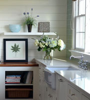
 I have one particular kitchen in mind where the paint color of the window and doorway, and baseboard casings match nothing in the kitchen, there being a blue green hutch that cannot be seen in the image in the link below, yet blends with (most) everything.
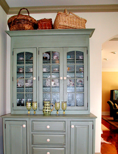
In this case, the client wanted very light walls without any sort of treatment on it, which to me, meant that white trim and casings would wash everything out, not to mention the cabinetry being an off-white. Can you say "bland"?
The decorator on the project was at a loss as to what color the trim should be, so I was consulted (I should have been consulted prior, anyway). The client chose the granite and the tile by herself. The family room has a wide opening to the kitchen, and the furnishings were more in the olive green family.
Due to the serious architecture of the house, I felt the trim color should be "serious" as well, which is why I ruled out a blue/green color. I felt it would have been too "candy cane", plus it would not transition well into the family room. I thought the color should be strong, yet feel somewhat neutral, yet with some color to it. Most of all, I felt the color should be warm, rather than cool, yet I did not see a tan shade here. Those were my intuitive feelings. I felt choosing a color which would sort of bridge several colors together, yet not match directly, was a good idea. The colors here are somewhat analogous, meaning, they are next to one another on the color wheel, which is one of my favorite ways to use color.
In the end, if I had my choice (and I didn't have a choice here in the following...), I would have chosen a different granite (if it had to be granite) and a different floor tile (if it had to be tile) and a different wall color, plus, I would have painted the niches up above, to have them stand out, as I believe they should. That's not to say it is not a terrific kitchen!
Whether you like it or not, you will have a reaction to this color. See it here.
Lesson: Don't be afraid of color! Your colors do not have to match. They should make sense in some way, and if they only make sense to you, that's ok too! Surrounding rooms have to be considered, as well as the architecture, other materials in the room, and wall treatment/color. Most of all, colors are seen in context to one another. More on that at another time. But, to my eye, colors look best, and most interesting, when they are slightly off from one another, maybe tied in with another color as a bridge, maybe not. Go beyond "matching".
How about you? How are you going to use color in your kitchen, or how are you using it now in other rooms?
 1 Comment

Reader Comments (1)
P.P.S., I changed it back to the olive green color. I made some major changes design wise, and decided to go in a softer color direction. The kitchen connection is, in terms of paint in the kitchen, you only know what you like when you put several samples on the wall and live with them for awhile, sort of as I did here.