ENGAGE:
The Kitchen Designer

Thanks for stopping by! I'm Susan Serra, certified kitchen designer, and my mission is to take kitchen design style, function and analysis to a higher level. Here's why the kitchen has the most honored place in the home - all five senses reside in the kitchen.  Best...Susan  Contact: susan@susanserraassociates.com
   

Follow my personal profile here on Google+ for LOTS of fresh content! Google+


JOIN ME IN MY NEW GOOGLE+ COMMUNITY:


Subscribe by Email


houzz interior design ideas

Follow on Bloglovin

Interior Design Blogs
Kitchen Design

SCANDINAVIAN MADE

Our webshop of handmade Scandinavian rugs and ceramics

BORNHOLM KITCHEN

Scandinavian inspired, warmly modern kitchens

DESIGN & CONSULTING

Custom kitchen design by Susan Serra, CKD, CAPS

SEARCH BY CATEGORY
SEARCH SITE:

Entries from June 29, 2008 - July 5, 2008

Saturday
Jul052008

French Country Kitchens - Tour de France Inspiration!

As you may remember if you've been a reader for some time, I LOVE the Tour de France!

I never paid much attention to the Tour until our son took up cycling in a very serious way, with dreams of riding in le Tour himself one day. That particular dream has been replaced now, but it was very much alive for a few years. And so it goes.

But, watching the Tour is now a fixture in our home. It's a beautiful sport, one of the most beautiful, I think. Combined with the incredible scenery, the colorful jerseys, the huge pieces of artwork in the farm fields as tributes to the tour, and the magnificent look of the peloton, not to mention the aerial views, I recommend it highly. it's on the channel Versus for the next 3 weeks until the triumphant entrance into Paris.

SO, in the spirit of the Tour and the beautiful tour of the French countryside, let's look at some kitchens. I think we can learn many things from looking at authentic French kitchens.

We get out of our comfort zone

We see new ways of looking at color and texture

We see new ways at looking at form and function

At other times during the Tour, I'll add more images of French kitchens, both modern, farm country kitchens, and formal, elegant kitchens as well.

And, tell me what your likes, dislikes, opinions on these kitchens. Have fun!! Want to rent a French chateau? Images are from Just France.

Tuesday
Jul012008

Kitchen Design - Less Is More

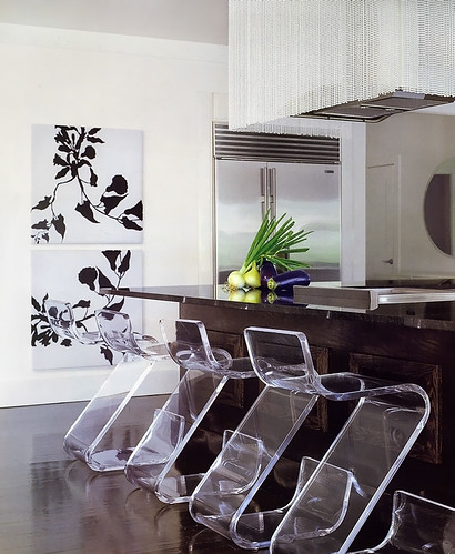
I came across this picture of a kitchen, again, in Veranda magazine, designed by Benjamin Noriega-Ortiz. I immediately liked it.

This kitchen goes more under the heading of "highly stylized" rather than "highly personal". More "showcase", less "high end catalog". And, that said, it's a viable look. Glam meets function meets texture. There was no other image of the working part of the kitchen.

I like the variety of elements, but what I like more is the strength, yet, restraint. I need to continue to explain to my clients that less is more. Fewer, larger, shapes and forms will enlarge a space as opposed to many, smaller, pieces, door sizes, accessories, etc. This is not a good vs. bad evaluation, simply an observation and another way to design a kitchen. The look is simple and elegant, so that the individual pieces say something meaningful yet are linked together in other ways, perhaps in color or tone, if not style

Here, my eye sees a variety of styles:

utility (stainless refrigerator)

rustic (dark wood island)

glamour (beaded hood)

something hip/fun (plexiglass chairs)

elegance/sophistication yet modern (prints on wall)

modern/sleek yet textural (floor)

contrast (floor and walls)

There are common threads among these elements which tie one disparate piece to another and it's fun looking for them.  I'm actually pretty crazy about this kitchen, although I'd probably want to change the prints to something A BIT more personal...give me that. But those chairs...what a WOW!

One question that comes to mind is, what came first, or simultaneously? Was the flooring color picked first, knowing that those chairs would be used, which relate to the walls in terms of tone? Was the big picture seen from the start, or were pieces brought in, to build on the previous concept. How were the layers developed? It appears to me that there was a desire to have a strong foundation first and foremost, as seen in the flooring and the island being similar tones. Other than that, it's hard to guess.

What do you think??

Monday
Jun302008

Kitchen Flooring II - Still Light Colored

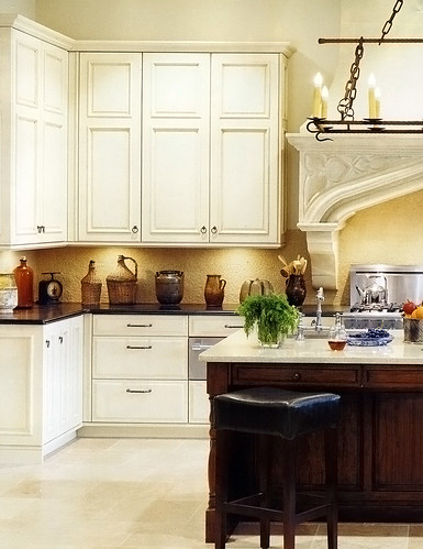
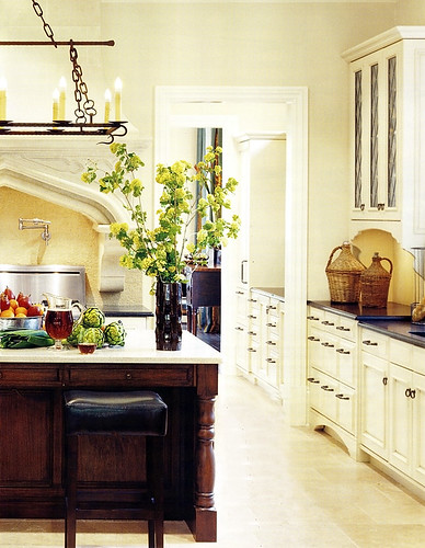
I've been meaning to show you this picture of another light floor. I simply love the feel of the light floor and the light cabinetry.

I like the horizontal dark element of the counters and I like the "important" or strong, feeling of the island in wood. 

The island, to my eye, does not overpower the other light colored elements. The reason it looks balanced to me is that there is so much MORE light colored elements in the room, balanced with just a few areas of the dark color. In other words, it makes sense proportionately in regard to color and tone balance. 

I also think this image goes a long way toward being serene, don't you? It has great interest, yet it is easy on the eyes and looks very spacious. The light floor, walls, and cabinetry, and understated backsplash, go a long way to achieve this quiet elegance. 

The floor...I think this type of floor, being quite textured, is fine in terms of being "busy enough" so you don't see every crumb immediately (unless you bake a lot of brownies.) The recent popularity of super dark wood floors is no better for spots, dings, dust, and so on. The best floor is a medium tone. But, to me, something REALLY speaks to me about a light floor. And, yes, for me, it would have to be textured. I'll have one, one day, in some form. This floor is limestone by Walker Zanger. Yes, limestone needs sealing and nervous care. I'm usually a conservative type, so I do not recommend it.

As seen in the June issue of Veranda.

What do you think of this combination of tones?