ENGAGE:
The Kitchen Designer

Thanks for stopping by! I'm Susan Serra, certified kitchen designer, and my mission is to take kitchen design style, function and analysis to a higher level. Here's why the kitchen has the most honored place in the home - all five senses reside in the kitchen.  Best...Susan  Contact: susan@susanserraassociates.com
   

Follow my personal profile here on Google+ for LOTS of fresh content! Google+


JOIN ME IN MY NEW GOOGLE+ COMMUNITY:


Subscribe by Email


houzz interior design ideas

Follow on Bloglovin

Interior Design Blogs
Kitchen Design

SCANDINAVIAN MADE

Our webshop of handmade Scandinavian rugs and ceramics

BORNHOLM KITCHEN

Scandinavian inspired, warmly modern kitchens

DESIGN & CONSULTING

Custom kitchen design by Susan Serra, CKD, CAPS

SEARCH BY CATEGORY
SEARCH SITE:

Entries from October 1, 2009 - October 31, 2009

Wednesday
Oct282009

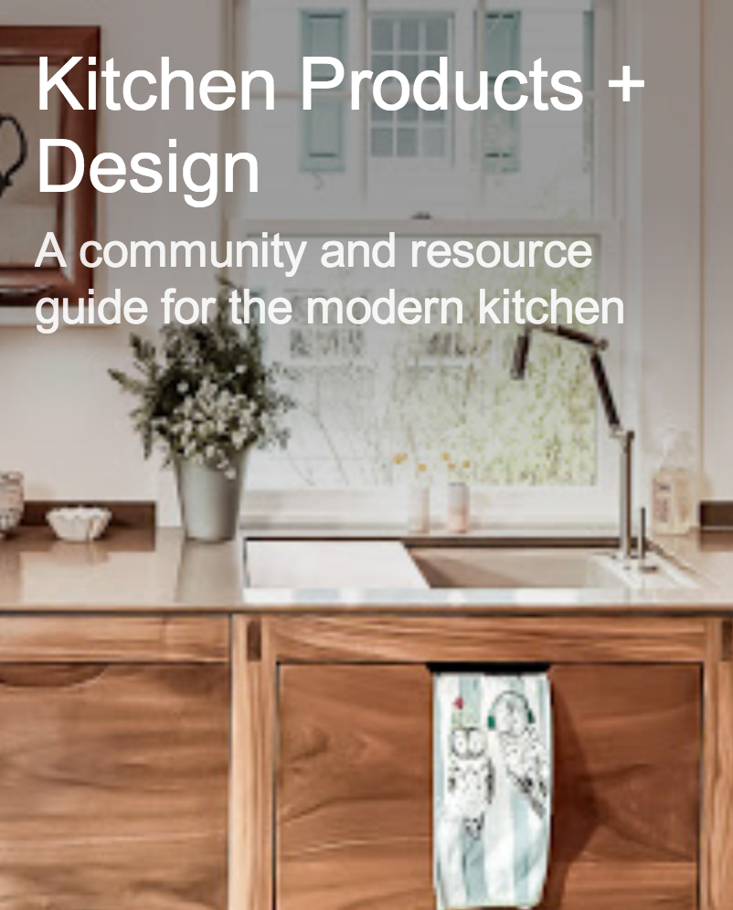
Open Kitchen Floorplan Or Closed?

The results are in! Thank you for taking the survey! The topic of the kitchen floorplan survey was spur of the moment for me. I had just finished a marathon session designing my own kitchen (in a dreamlike state as it is at least a year or two off). Suddenly, grappling with issues and questions pertaining to a wide open (to the entire main floor) vs. a partially open floorplan, I thought it would be very interesting to hear what others thought...especially now. So, I put up a quick poll and noted it on Twitter.

Now, we are in, what many think, is a different time, a kitchen "evolution". Many of us are enjoying our homes in a renewed way. We're cooking more, entertaining more, we're together more, a mix of multi-generations coming together. We're becoming reacquainted with our homes and finding great comfort there. I'd written about how the kitchen was changing in the past 2 years prior to the "Great Recession" but that event put this trend on the fast track. We want to be together more. Therefore, more activities are taking place in the kitchen. Yes, even more than we've previously read about over the years in all the magazines. 

In the 80s and 90s, the walls suddenly came down between our kitchens and dining rooms or family rooms. That is why the island became the "must have" element in the kitchen. The kitchen became even more social. And, that trend continued. It's only increased in importance, as a social magnet, as the years went on. 

I predict that islands will become even bigger in terms of their size. I predict that little by little, our cabinetry will leave the perimeter walls, or at least one or two of the walls, and will become centered in the kitchen, where possible. I see a change. I think it's in the air, but still in the clouds a bit, perhaps. 

I think a lot about this topic, and I always have...where we are in our kitchens now, what we might want, how we live in them, contemplating the future.

So, on to the survey!

The survey had 150 responses, a good number. Next time I may keep it up longer. But, here's where it gets really interesting...

For a period of time on Twitter, I put out tweets with a link to the survey. Suddenly, I realized that I forgot to put the survey on my blog, but that was quite awhile after it had appeared on Twitter. I was very surprised at what happened next. 

The results from Twitter were markedly different from the results on my blog. I find that fascinating and here's why. On Twitter, I follow many designers, industry leaders, allied professionals and manufacturers of kitchen related products. THAT segment of the responses far and away responded to the survey from many to fewer responses in the order that the questions were asked. I did not capture those statistics because I did not expect this differing result, which was to come (afterward). Thus, far more responses on Twitter voted for a wide open, loft-like kitchen environment. 

Those who voted in the survey on the blog wanted their kitchens less open. I saw fast and consistent results in this pattern, as I monitored the survey.

Here are the original questions that were asked and the OVERALL percentages:

If you could choose, would you like the kitchen to be open to surrounding living areas or closed off?


  • totally wide open to surrounding living areas, loft-like 25.5%
  • open just to one living area 38%
  • partially open kitchen (barriers, 1/2 walls) 27%
  • closed off from all surrounding rooms 9.5%


These results tell me several things:

Forget about wanting to cook in private. We don't want to be isolated or need to be. That era is over for the vast majority of people.

Considering that there were more blog responses than Twitter responses (blog responses generally did not favor a loft-like kitchen) I think it's very interesting that the (overall) responses to the first question was as high as it was. We're moving toward wanting our spaces to be even more open. That's what that number of 25.5% tells me. I think it's impressive, and interesting.

The kitchen being partially open at 27% assumes that homeowners are comfortable being somewhat exposed to surrounding living areas. So, I'm thinking that if we put the first and second numbers together, they are sending a strong message toward designing the kitchen into an open floorplan. And, perhaps the 27% number represents those who currently have closed off kitchens, and are taking a small step visually toward a more open space, but not too open. But, I cannot be sure of this interpretation.

The difference in who the respondents are...professionals primarily in the design industry on Twitter vs. the general public, my readers, who responded to the blog survey, is also interesting. While at first, the difference in the voting results between the two groups was a surprise, I think the "Twitter effect" must underscore the comfort level of design/industry professionals in regard to, perhaps:

  • wanting the eye to travel further in the space
  • a desire to have freedom of movement
  • a desire to unite several areas creatively under a common theme
  • an understanding that a dwelling with multiple people in an open space can foster relationships in a positive way, invite togetherness, along with a physical ease of communication

And, I'm sure there are other issues that these respondents considered. 

In short, it tells me that the Twitter respondents have a unique vision. The response of the blog readers tells me that they increasingly wish to be in a mostly open space, most likely for some of the very same reasons just mentioned. 

I know I've gone on forever. Please tell me your thoughts about this topic!

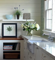
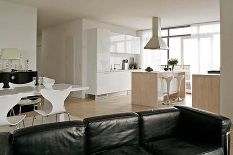
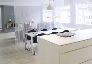
Images: KLMDesign (1) and Boligmagasinet (2)


Monday
Oct262009

Random Kitchen Musings

Just a few little things...

PLEASE take this survey: Kitchen Floorplan: Open Or Closed? It's seemingly a simple question, but the results are fascinating as the votes are coming in. I'll share them with you shortly. Please cast your vote. It takes 10 seconds or less, and I'd love to know what you all want, or dream of, for your own kitchen design concept. UPDATE: SURVEY IS CLOSED

Please also go to my blogging buddy Renovation Therapy's blog...that is, if you'd like to win an Itouch Ipod! Again, it's fast, easy, and it could be yours! While you're at it, read a few posts...she's wickedly smart, insightful, funny, cool...not in that order, although the smart part is probably at the front of the line. I better quit while I'm ahead. 

Take a look at Natalie Blake's wall art...in the form of handmade tiles. These are not just any tiles. They are sculptural in their form, sensuous, with curves everywhere. Unulun tile gets its name from the undulating form of the tile. Rich, strong, colors. Grouped together as wall art, its three dimensional perspective delights and attracts the eye. In other words, they are, to me, amazing. I first saw this tile at the Architectural Digest show in New York and immediately asked to take photographs, and I couldn't stop. Enjoy!


More randomness...I'm beginning to play with my own kitchen design. This will be the fourth time I've designed a kitchen for myself/my family (I almost forgot about them.) I have no immediate plans to do the kitchen although it will need to be done at some point in the next couple of years, hopefully. But, I became inspired and am catching the bug to design my kitchen. I think it begins with an "o".....obsession!

Don't forget to take the survey!

What about you? Are you obsessed with your kitchen?

Tuesday
Oct202009

Woodworking Woes

Here's an email message I received:

From: Tracy

Subject: kitchen banquette

Message: My woodworker was supposed to make my kitchen banquette 17" high and it ended up being 18.5". Now with my 3" cushions, the seating comes in at 21.5". It looks attractive, but it's higher than I would have liked. I paid a decent buck for the custom banquette and cushions. What do you advise?

Tracy, there are multiple issues in this short email. 

First, does your woodworker acknowledge that there is a mistake? It's understandable that you did not measure it until he was done because, of course, you trust him. 

Second, I'm not sure that that 1 1/2" will make much of a difference. I mean, with these numbers, yes, the lower the better. But, I think it will still feel high. As a comparison, I normally (depending on the cushion) set the height of my banquettes somewhere between 14 and 15", usually around 14-14 1/2", anticipating a 4-5" thick cushion. For a 3" cushion, I'd probably size it somewhere around 15 1/2-16" high. 

Third, this matters if he is not acknowledging an error. Do you have documentation on how high the banquette was to be?

Fourth, if he does acknowledge that it was not accurately sized, and if you decided you wanted it lower than originally planned, ask him to make it lower. 

Fifth, are there any decorative panels on the face of the banquette?

Sixth, are there any other issues such as wallpaper or other moldings or the rear of the banquette if there is one, that is affected?


Those are my preliminary thoughts, knowing nothing more than what you've told me so far. I hope this works out for you. 

It's a rare client who will think to take a tape measure to woodwork that has been installed, nor is it their responsibility to do so. But, in a case like this, where the piece is finished, I do think Tracy deserves to get what she originally paid for, however it has to be worked out by the woodworker. What do you think?

Monday
Oct122009

The Kitchn - Fall Kitchen Cure

You know that saying, that a lawyer who represents himself has a fool for a client? I can relate, especially when I see the notice for the fall Kitchn Cure. I've meant to do this before, and I'd really like to get into it this time. I'm always open to learning from others...and new organizational concepts sound helpful, to say the least. They always have a plan for a happy and healthy kitchen! It's a great community effort, best of all. 

Sign up here! 


MY POSTS ON KITCHEN DESIGN AROUND THE WEB

I do a fair amount of writing for other wonderful blogs, and it's time that I gather together some recent posts I've done and put them all in one place in case you have missed them. Here we go:


DECORATI.COM

Fine Dining...In The Kitchen! 

White Kitchens - A Philosophy

A Few Of My Favorite Things

French Country Kitchens - The Next Frontier?

Wood Flooring For Kitchens

Pyrolave - Countertops On Fire!

Beyond The Bar - Inspiration From ICFF

KBIS Couture


THE KITCHN SERIES ON COLOR IN THE KITCHEN

Kitchen Design - Color For The Long Term

Modern Kitchen Design - A New Authenticity

White Kitchens - The Absence of Color

Color In The Kitchen...On The Cheap!

A Pinch Of Sugar Color


HOME WORKSHOP

Ten Budget Ideas To Update Your Kitchen


Enjoy! (A quiz will be given next Monday...bring two #2 pencils.)


Friday
Oct092009

Thermador Appliances - Stepping It Up

A couple of days ago I went to an event hosted by Thermador at their showroom in Dumbo, Brooklyn, which, if you haven't been to either the showroom or Dumbo, I can tell you that they are both great destinations (well, you can go to Dumbo without going to the showroom, but you can't go to the showroom without going to Dumbo...I'm confused!) I've included images of the showroom...it's in one of those great, old, waterfront factories, steps away from crazy views of the Brooklyn bridge. 

The event was to showcase a myriad of recent developments...in a couple of cases I'd call them details, but, details are everything, especially to a blogger who is also a kitchen designer. My work is all about the details. No detail is unimportant, I've always said. They build on one another. So, here they are. 


Thermador is reintroducing their star burner (developed 11 years ago by Thermador) by elevating its position on the cooking surface, providing increased btu power with low simmer ability, and a quick clean surface below. Flexible cooking/effortless cleanup. 

The combination of Thermador's Sensor Dome infrared sensor technology and the industry's most powerful induction element, at 4600 watts and an expandable 13" wide diameter triple zone element monitors the temperature inside the pan, cycling it on and off to maintain a precise temperature.

The introduction of a dishwasher is Thermador's entry into high performance dishwashing. A 3 step "Rackmatic System", chef tool drawer, hand wash cycle, extra dry, and a very sexy sapphire glow lighting system (interior blue lighting) among other notable features, make this a dishwasher which must be considered...this is a "finally" for Thermador, to have a strong dishwasher in their line. 

A new easy installation system for Thermador's stainless steel refrigerators is now here. Built in modular refrigeration can now come with framed and pre-assembled panels and trims which offer a speedy installation and a new finished design, once installed. The fully flush collection continues to offer a completely seamless installation and design. It's about design flexibility...one of those details which makes the difference in how your refrigeration system is visually experienced. 

I took a good shot of the Brooklyn bridge while I was going into the city after the event with my iphone...while driving (I couldn't resist) Enjoy!

Wednesday
Oct072009

c/o The Maidstone East Hampton - Scandinavian Design

c/o The Maidstone, located in bucolic East Hampton, is a Swedish design tour de force. For design addicts and design junkies, it is a destination, a lesson in color, in light, in an eclectic historical and modern Swedish design.

At the moment, this post was further down on my list of things to do, but as is true for all of my posts, they come when I am inspired, and I just cannot hold on to these images any longer, I need to share them!

Nadia Tostoy, design director of c/o The Maidstone, desired to create a "Scandinavian cozy" theme, a historical yet modern environment. Inspired by Josef Frank fabrics, color is a foundation of c/o The Maidstone and the turquoise walls in the entrance and beyond immediately reach out to welcome a guest. C/o The Maidstone was purchased by Swedish hotelier Jenny Ljungberg, who injected a Swedish free spirit into the previously typical Hamptons "rustic chic" traditional spaces. I have had the pleasure of staying at the previous Maidstone Inn numerous times and this time we stopped by for a wonderful, lingering, breakfast, and the word "wonderful" is probably understated. This was last Saturday.

As many of you know, I have a passion for Scandinavian design by connection to my own Danish heritage and visits throughout my life to my families' homes in Denmark and Norway, so this visit was eagerly anticipated. As all the guest rooms were booked, I did not have the opportunity to see any of them, but I will in the future. 

As I study the interiors with a critical eye, well, before that, let me say that my first impression was an incredibly positive WOW...gorgeous, exciting, beautiful! I WAS excited (and I certainly still am!) As I take time now to look at my images, as in any interior, the question comes to mind...does it look "designed" or does it look like a natural compilation of pieces, particularly in the sitting rooms? To me, it looks, for the most part, carefully coordinated. For me, the standard for the evolved look is the traditional English interior which always seem to give the feeling of each and every piece having been added at a different time, but it all just blends, all the "lite" eclecticism of it. There is much eclecticism here, but it seems much more controlled. A nitpik might be that I may have liked to have seen a bit less Josef Frank. Not less color, necessarily. 

All that said, there IS much to be said as well for a controlled design perspective in a space like this. Selecting a few prominent threads to play/work with such as color, Josef Frank's textiles, the shade of gray, as themes, create a flow which serves to connect many multiple seating areas and which in this case is very interesting. There is a free spirit running rampant within these design threads as seen in the art installations, gray sheepskin throws over crisp white traditional shelving, and more which, to my eye, break rules in a very positive way. 

The juxtaposition of the dark, dark gray wall color and the extreme white ceilings and walls is, to me, perfection, and note the shiny ceilings. The flooring provides warmth in a lighter tone and within those neutrals, color chaos reigns supreme. To my eye, the antique Swedish rag rugs (I own 3, buy them here and scroll down) play a very important part in bringing a slightly worn authenticity to the space. I may have liked to have seen a bit more of that concept, just a bit. The traditional elements of the furnishings are welcome and their sculptural lines add a sort of friendly feeling. In fact, the furnishings are filled with sculptural lines, often in bright colors, which add a whimsical, yet sophisticated, look. 

For more information on Scandinavian interior design, visit Avolli, and Willow Decor. Also do not miss Emmas Designblog and PurpleArea

The BIG question is, what sort of kitchen would you design if we were inspired by this interior?

For Part II on this theme, I'll give you my thoughts...in the meantime, tell me what sort of kitchen you see here, and I promise I won't be influenced!

CLICK ANYWHERE ON EACH (LARGE) IMAGE AND IT WILL GO TO THE NEXT IMAGE

OR VIEW IT IN BIG BEAUTIFUL IMAGES IN THIS SLIDE SHOW


Get the flash player here: http://www.adobe.com/flashplayer
Tuesday
Oct062009

New Kitchen Products

I'm a bit lax on telling you about some new (or if not new, then cool) products. Here are a few interesting ones.

But, first, within this section is a product which I was asked to personally review. My policy, like many bloggers, is and has been (the one other time that I reviewed a product) that if I like the product, I will review it. If not, I will not. And, I mean, I will not. I do not ask to review products. Example: There is a product which I was approached about and was subsequently sent to me at least 2 months ago, maybe 3 months. There is a small kit which I needed for a certain type of installation in order to review it in a way that makes sense to my lifestyle and I requested it initially. The product functions perfectly without it, I can experience the end result, but it is not how I would normally use the product. I'll review the product if the kit comes unless there is a compelling reason not to. A second example is a colleague of nearly 20 years who sent me her just published book and asked me to review it. I felt the book was poorly written, declined with a diplomatic yet honest assessment, and that relationship declined as well. I have obligations to no one within my industry.

I see nothing wrong with sharing my personal use experiences that are connected to reviewing an occasional product. If I'm extremely enthusiastic about it, that will show. If it's a nice, simple, product that is a generally pleasant experience to use, that will show too. There will be decibels of difference in enthusiasm, so to speak, in my reviews which will honestly reflect my personal experience with a product. Will I say anything negative about a product? Sure. If I dislike it overall, I do not see the purpose of using this platform to make that type of (negative) announcement. In that case, I'm going to assume that it may just not speak to my lifestyle needs/wants. I think this concept serves no ill purpose, whatsoever. In fact, I think it's a positive and helpful service to my readers for a variety of reasons. I hope you think so too.


 MGS T45-DF One spout, two waterways built in, three levers: hot, cold, filtered. Normally, one has an extra spout mounted for filtered water. Made of solid stainless steel, lead free (of course) and NSF certified, it is 100% non toxic. Their own design team has created the faucet, and many others, which MGS calls innovative functionality, with an emphasis on convenience and performance. I am one who likes simple lines. I think simple often = elegance, and I do think this is a very elegant faucet system.


 Studio Italia Design has introduced a MUST SEE lighting fixture. Why? It redefines the single flourescent ceiling fixture in a huge way. Here are their words: "The Inpiega by Italian Designer Marco Ferreri is available as a sconce, table lamp, floor lamp or suspended fixture. It calls for fluorescent lamping and offers both direct and indirect light. With an entirely modern shape with geometric lines, the inner side is available in white, while the outer side can be done in white or raw aluminum."


GelPro floor mats GelPro asked me if I was interested in using their product in my home, and I accepted. I had certainly heard of GelPro when they first introduced their product, maybe a couple of years ago, and I had mild interest, but not much more than that.

Having moved into our new (not newly constructed) home 9 months ago and living with a tile floor (which I never had before) it made a lot of sense to try it. FYI...I did not design my kitchen in the images...it's 20 years old, so a renovation is in my future, for sure! 

I came home after a short trip last week, and my husband had the GelPro mat in place. My initial reaction was WOW! It looked really great. Upscale, cool, designer-y, I was extremely impressed. You must take a look at all of the styles and colors. The selection is fantastic. I was a little nervous, because some of the images to my eye did not look that promising, but it was helpful to see both close up and far away shots, in fact, very helpful. Because of those shots, I decided I wanted something that looked like a visible pattern from a ways away. It was very tough to pick a color, the options are great, but I settled on the deep, rich brown, which I LOVE.

The sensation, once I stood on the mat, was truly a surprise. I did not expect the surface to be so soft, especially given the particularly busy pattern. It looked like, and I expected it to be, a semi-tough top surface, for wear purposes. It was not-it was soft. It's great on the feet, it's not too soft and not too hard. I'm sorry I didn't take a closer look at GelPro earlier. The mats come in special "designer sizes" as they are referred to. In fact, there are many different sizes. The performance and looks far exceeded my expectations, very much so. I'm happy to be able to report this.


Sub Zero UC-15I Ice Maker - Sub Zero introduces an ice maker. At 15" wide, incorporating the flush installation Sub Zero is famous for, this appliance can easily fit anywhere. It makes 50 lbs of ice in one day and stores up to 25 lbs. Best news yet, the ice is produced with filtered water, and the filter even tells you when it needs to be changed! Now, that's good thinking. The controls are electronic, the face is stainless steel, and there is led lighting. This ice maker is approved for outdoor use...see the site for further details. Literally....cool!

Monday
Oct052009

A White Kitchen - Tricia's Interesting Design Choice

I'm pleased to show you a blogging buddy's kitchen. The kitchen is Tricia's from Avolli, the online store for Swedish antique furniture. Gorgeous stuff, all different price points, and some of my favorite things are the antique rag rugs. Just love them!

Tricia's kitchen is very lovely, but there is one feature that immediately jumped out at me...a feature that I have never designed into a kitchen, which is a big reason why I find her kitchen so compellingly interesting (besides the red, which I love!) I immediately questioned Tricia on it first thing. Questions surrounding any angle I could think of.  To my surprise, my questions were met with a "huh, should there be an issue here?"

OK, what's the issue? Tricia has her cooktop situated in front of her window.

I know it sounds as if I next expected to tell a story of the kitchen police visiting Tricia's home, but trust me when I say, this is a highly unusual location for a cooktop, let alone a range top.

Tricia reports (after my countless crack designer questions) that there is zero issue with cooking fumes, grease and moisture landing on her windows, woodwork or curtains above, zero. Tricia has a downdraft ventilation system behind the cooktop. I asked Tricia repeated questions all around this issue, and of course, I believe what she reports. Maybe it's a testament to the efficiency of the Viking downdraft.

Here's more on Tricia's kitchen, a Q&A:


What were your original goals? What was most important to you?

When we purchased this house in 1998, the original kitchen had builder made cabinets, which in our case were poorly constructed and designed.  There were no tracks on the drawers, there was dead space in the design, the appliances were outdated, and overall it was unappealing to us.  We wanted a brand new kitchen with top of the line appliances and beautiful details in the overall design but within the existing floor plan.

Were your goals achieved?

In my opinion we did achieve a beautiful kitchen with wonderful details.  The door panels on the cabinet ends, the dentil moldings, columns and plinths that flank the cabinet ends, the built-in hutch with internal lights all contribute to what I find to be quality and beauty.

Tell me about the window behind the cooktop. Did anyone try to talk you out of it? Were you nervous about it?

The windows are part of the original floor plan.  We could not remove them, or change the kitchen footprint, without making major changes to the rest of the house.  I was not nervous about having the cook top there because that is where the original cook top was so it seemed ok to me.  Honestly it never occurred to me to not have it there.  I enjoy being able to look out the window when I cook.

Did you work with a kitchen designer or cabinet maker or what? What was that experience like?

I did work with a kitchen designer and remember it as a good experience.  I had strong ideas and opinions and was highly detail oriented in the process.  It is my understanding that the installer took some issues with the designer though.  Something about designing a kitchen that was nearly impossible to install??? I don’t remember the issues clearly but do remember him grumbling throughout the installation.

What did you want in your appliances? What was important to you?

We definitely wanted high end appliances and felt strongly about an integrated Sub-Zero and dishwasher, double wall ovens and the six burner Viking cook top.  I wanted the double wall ovens because I have a bad back and bending down to put things in or take things out of a traditionally designed oven would not work well for me. We have loved having two ovens and not having to struggle or juggle when planning big meals or for holidays.  My husband wanted the large, single bowl sink for washing big pots, etc. We both wanted the island prep sink which had become quite popular at that time.

Do you cook much? Do you like to cook?

The first part of my marriage I absolutely loved to cook and would read cookbooks in bed at night.  It was fun to created elaborate home made meals to dazzle our guests…and I did all that on an old and outdated kitchen.  By the time we bought this house and renovated this kitchen my children were in 2nd grade and pre-school and were very picky eaters.  This became disheartening to me because I would create a wonderful meal and they wouldn’t eat it.  As time when by their willingness to try new things did change and I was cooking less and less and resorting to the easy meals that I knew they would eat.  Now that I have one off to college I am starting to rediscover cooking, to my husband's delight, and look forward to the weekends when I can devote an afternoon to creating something special.  

I think it's a very nice renovation, and I love the family room too. Thanks, Tricia, for sharing your kitchen with me! I'm secretly jealous of your cooktop under the window! 

Friday
Oct022009

GE Monogram Appliance Adventure

I had an eventful past couple of days, being immersed in GE Monogram appliances via invitation to GE Monogram's headquarters in Louisville, Kentucky. 

Louisville (Loo-uh-vuhl or Loo-ee-vuhl or Loo-ee-vill) is a great place to visit! Home of the Louisville Slugger, really great old architecture, a mix of old/new food, arts, architecture, nestled alongside the Ohio River, if it had to be renamed, I'd rename it Pleasantville (or vuhl). I just love going to places I have not been to before. This is one sweet city, emphasis on sweet, as in charm.

The hotel we all stayed at was, simply, fantastic. The second day of training actually started at the Kentucky Museum of Art and Craft. I had a few burning questions...do they have a gift shop, do they take Amex and do they ship? $400 later, the answers are yes.  I love handmade crafts, and the prices at the gift shop were very good (shhh!)

The group was a mix of professional kitchen designers and a few remodelers and design professionals from architectural firms. Sure, it's immersion in a brand for nearly 2 days (3 full, including travel) and that's a good thing. I'm not a kool-aid drinker, although I do look for positive information and try to listen to my inner voice if details/issues crop up that I'm not in tune with. I can report that the product details that I learned about felt overall, solid to me. They will hear from me on one issue in particular that did not sit well with me, but no one is perfect.

I'm impressed, most of all, with GE Monogram's pro range. I've never been, believe it or not, a super fan of pro ranges of any ilk. The logical thought process about my view (one would THINK) might be that I pooh pooh them as being status symbols, which I'm sure they may be to some. However, my concerns have always been rooted toward the concern for those who are immediately seduced by several features...their size, power, brand name, not to mention being influenced by the sex appeal of the ads. In other words, I think a large number of homeowners just lose all logic when they see these cooking monsters in an appliance showroom. I've always thought that. Does the kitchen design follow the appliance package or vice versa? See what I mean?

Am I a total buzzkill?? 

So, my advice is to think of the feeling you want your kitchen to convey as you begin to design it, even before that process begins. A pro range, its large volume, has everything to do with the design message that your kitchen will send to those who enter it, in a positive or negative way, depending on what your vision is...if you are truly connected to it. But, that's also a bigger discussion for another day. 

Let's assume you're on track, after careful consideration, to purchase a pro range. The GE Monogram pro range has been recently completely redesigned...from scratch...and was introduced just last year. 

The design and the features are impressive, beginning with the installation...having four wheels and a power cord, it's an easy installation. And, if you care for your floors, you should care about these 4 wheels and an easy installation!

Here's a rundown of some cool features: Do you have a need for power? Maybe 72,000 btus over 4 burners should do it. Covers for the grill and griddle are included, full extension pull out racks, burner grates that turn upside down to accommodate a wok (see image), the grill grate that has a groove in it on one side to drain fat and a flat surface on the other side for fish/veggies, and a griddle that's adjustable in height are good places to start. 

I love the grain on the stainless steel. It's very consistent in color and finish all around the range. The knobs are a nice, modern design and color. The range is beveled on the corners, which makes for another nice installation detail and each knob has an indicator light. 

Another great product, which you can see in the cooking image (that's our group cooking-we were slaves and cooked 3 meals throughout this training...from scratch) is the induction cooktop. GE Monogram has one of the most powerful induction cooktops around. I cannot expand on this too much at this moment, but two things come to mind...power and instant response...ok, three, incredibly easy clean-up. 

Gotta run...the GE Experience Center, as it's called was a good experience. Did you know GE has their own zip code? Yeesh! GE people, feel free to answer comments and questions.